 OK, this title may sound a bit heavy, especially for this time of year. Let me break it down for you. There are various correlation metrics out there, which can handle two variables (let's call them x and y) and measure their relationship. More often than not, these metrics focus on the linear aspects of this relationship and are often confused by the non-linear ones. For example, a correlation metric like Pearson’s Correlation can tell you that a variable y defined as 2x + 5 is strongly correlated to x (a shocker, isn't it!) but if a variable z is defined as exp(x^2 + 1) were to be used instead, well Pearson's Correlation might struggle with that. A mathematician or even a Stats professional would assure you that there is a non-linear relationship between the two variables (x and z), but they'd have to rely on a plot of the two variables or some transformation of one of them (e.g., applying log() to z) if they were to measure this relationship. Things get even more complicated if the relationship is not as simple, e.g. that of x and a variable w defined as cos(x). Most likely, Pearson's correlation won't find anything there (a relationship close to 0), even though the Math or Stats professional mentioned previously would be sure there is a relationship there. So, what gives? Well, what gives is a big question that if I were to answer it here, it would shake your belief in Stats like a super quake, similar to that which brought San Francisco down over a century ago. Interestingly, most Stats concepts are from around that same time, perhaps a bit older than that. So, you've got to give those guys a break since they didn't know any better, plus they didn't have the tools we have at our disposal. Given the circumstances, they did a pretty good job at defining the metrics they did and weaving the fabric of a theory around their methods. Come to think about it, if modern mathematicians were like them, we'd be reasoning in high-dimensional terms now, instead of relying on these old-fashioned formulas and techniques. I propose a method based on the BROOM framework that looks into the non-linear and non-monotonous artifacts of a pair of variables to establish their relationship. This metric, which I call rbc (range-based correlation, as it's part of the ranges part of the framework), explores the two variables in an entirely data-driven manner, making no assumptions whatsoever about their distributions and their other aspects. As long as they are normalized, they are good to go. And this metric, contrary to all other correlation metrics I've tried, yields a correlation of 0.99 for the x-w pair and a similar figure for the x-z one. When you compare x with some random variable q (q belongs to the [0, 1] interval), it yields a weak correlation (usually between 0.1 and 0.2). As a result, we can deduce that it's a worthwhile metric for measuring the relationship between two variables, taking into account all non-linear artifacts while being unaffected by any lack of a monotonous pattern the two variables may exhibit. If you are interested in learning more, feel free to contact me. Cheers!
0 Comments
 Everyone can analyze data these days, given the right programming tool and some library of functions, to express practically the relevant know-how of that person. I've seen people who give away books for free (as it would be impossible for them to get others to buy them) analyze data. As data science becomes more widespread, data analysis becomes a given for a larger portion of the population. But what about data synthesis, however? What's up with that? Let's delve into this. First of all, let's get some definitions down. Data synthesis is the creation of synthetic data that follows a given pattern. The latter can be given directly to the data generation program, or it can be derived (extrapolated) via data analytics. Synthetic data is ideally indistinguishable from conventional data, and you can use it to train a data model, for example. However, there is something that makes it extremely valuable. The value of synthetic data lies in the fact that it's not tied to particular individuals, so using this data doesn't pose any PII-related issues. Because of this, it cannot be owned by any specific person, even if it can be leveraged in the data science pipeline, yielding value. Naturally, since there are no shortcuts to value-making, the value (information) of that synthetic data must come from somewhere. So, since it's not practical for someone to have a high-level mathematical representation of this value and give it to a program as a pattern, it's more likely that this value stems from the source data. So, to have valuable synthetic data (that's also free of PII), we need to have some source data of value, for starters. That's why the only practical way to generate synthetic data that's worth its space on a hard disk is via analytics. Of course, there are ways to generate such data through analytics, as in the case of some specialized deep learning networks (Autoencoders). The catch is that these A.I. systems require lots of data to do their job. After all, analyzing multiple variables isn't easy, even for an A.I. What if there was a way to perform the same task without employing these more advanced data-hungry systems? Enter the BROOM framework again! We've already described some of its functionality, but what if this was just a prelude for its more sophisticated aspects? Well, fortunately, data synthesis isn't all that different from sampling, if you know what you are doing? And if you can sample a dataset properly, it's not that much more challenging to create new data points aligned with its essence. Naturally, the synthetic data is generated in a stochastic manner since it makes more sense to leverage noise in this process. Otherwise, all the generated data would be the same every time. Oh, and did I mention that this data synthesis process is scalable to as many dimensions as you like? Because if you understand data in-depth, the cardinality of vectors in a dataset is just another number...  I've been trying to answer this question for years. Well, not many years, but still, at least since the second half of the previous decade. Why? Well, I've always liked to explore the boundaries between the continuous and the discrete and since I finally internalized the teaching that everything in this universe is discrete (see: Quantum Physics), I decided to explore that angle and see if there was indeed a way to turn a continuous variable into a discrete one, with minimal information loss. Over the past few months, I've developed three distinct approaches, depending on how distinct the values of the target variable are (see what I did there?). Let's start with something simple: no target variable at all. So, how can we discretize a continuous variable x? Well, you have to binarize it until there is no more binarization possible! But how do you optimally binarize a variable? That's something that involves densities after you handle all outliers and inliers in x, of course. How do you do that? Well, that's a topic that can fill a whole book chapter, so I'll have to draw the line here, I'm afraid. What about when there is a target variable? Let's start with a binary one as it's simpler this way. We can employ a robust similarity metric that can assess the similarity of two binary variables, regardless of their alignment or any similarities due to chance. Fortunately, I've developed one such metric, which I call holistic symmetric similarity (HSS), which also works with all sorts of discrete variables. So, by using this metric, we can optimize the split to maximize the HSS score between the binarized x and the target variable y. The same approach works if y is discrete but not binary since I've generalized HSS to handle nominal variables too. Ok, but what about when y is continuous, though? Well, that takes a bit more creativity since it's not as simple a task as it may seem. Fortunately, it's doable and relatively light, computationally speaking. We can find the threshold that maximizes a custom correlation metric that becomes larger once any non-linearities are tackled. This process doesn't have to be rocket science since I'm sure you can come up with a metric like that if you've been mentored by someone worth his salt in data science. Of course, you could use a translinearity correlation metric, yet, I wouldn't recommend that since it would inevitably pick up signals you wouldn't want it to, plus it's bound to be more computationally heavy. So, there you have it. You can binarize and therefore discretize any feature x you like, with or without a target variable. The latter can be binary, discrete, or even continuous, depending on the problem at hand. Such a process can help you preserve computational resources and perhaps even enable you to make better and more transparent models (after all, binary variables tend to be easier on the mind, not just on the computer). All this I've done in the OD.jl script, which I cannot share here, unfortunately, as it has dependencies on proprietary code (the BROOM framework), which I'd rather not give away. Still, if you wish to explore this topic further, we can do that in a one-on-one mentoring session or two, given that you have the required commitment to the craft and a genuine interest to learn more about it. Cheers! Creating Diagrams and Unconventional Graphics for Data Science and Data Analytics Work – Revisited7/5/2021  I realize that I’ve done this topic before, but perhaps it needs some more attention, as it’s a very useful topic. Diagrams are great, but they are also challenging. As for the other graphics (particularly those not generated by a plotting library), these can be tough too. But both diagrams and these unconventional graphics are often essential in our line of work, be it as data scientists or data analysts. Let's examine the hows and whys of all this. First of all, diagrams and graphics, in general, are a means of conveying information more intuitively. When you look at a table filled with numbers and other kinds of data, you need to think about them, and sometimes you have to know something about the context of all this. With diagrams, you may get an idea of the underlying information even if you don't know much about the context. Of course, the latter can help bring about scope and perspective, helping you interpret the diagram better and make it more applicable to the task at hand. Diagrams and unconventional graphics are paramount in presentations too. Imagine going to a client or a manager with just a code notebook at your disposal! Even if they may appreciate you having done all this work chances are that you'll need more than that to get them on your side and see the real value behind all these ones and zeros! Besides, the adage of "a picture is a thousand words" is valid, even in Analytics work. Data modelers have figured that out a long time ago, which is why diagrams are their bread and butter. Perhaps there is something to be learned from all this. But how do you go about creating diagrams and unconventional graphics in general? After all, graphics design is a challenging discipline, and it's not realistic to try to do this kind of work without lots of studying and practicing. Also, it's doubtful we'll ever be as good as graphics professionals who often have the talent to drive their know-how. Still, we can learn some basics and create decent-looking diagrams and graphics, to facilitate our data science endeavors. For starters, we can invest in learning a program like GIMP. This software is an open-source version of Photoshop, and it's well-established and documented. So, if you have a good image or graphic to work with, GIMP can make it shine. Also, programs like LibreOffice Draw can be practically essential for this sort of work, especially if you want to build something from scratch. Contrary to what some people think, creating graphics is very detailed work, not some artistic endeavor. You need to use both your analytical and your imaginative faculties for such a task, even if the imagination part may seem dominant, at least in the beginning. So, for any graphics-related tasks, remember, zooming in is your friend! As for the properties box of any graphical object, that's your best friend! Anyway, I could go on and talk about graphics in data science and data analytics work all day, but it’s not possible to do this topic justice in a single blog post. Besides, the best way to learn is by practicing, just like when it comes to building and refining data models for your Analytics work. Cheers! 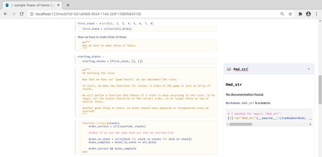 Introduction
Code notebooks have become a necessity for anyone doing any serious work in this field. Although they don't have the same functionality as IDEs, they are instrumental, especially if you want to showcase your code. Also, it's something that has evolved quite a bit over the years. This notebook covered in this article is seemingly the latest development of this evolution, at least for the Julia programming language, in data science work. Don’t You Mean Jupyter Notebooks? I understand why someone would think that. After all, Jupyter notebooks are well-established, and I've often used them myself over the years. However, this code notebook I write about is an entirely different animal (you could say another world altogether!). Neptune notebooks have little to do with Jupyter ones, so if you go to them expecting them to be just like Jupyter but better, you'd be disappointed. However, if you see them for what they are, you may be in for a surprise. A Voyage through the Solar System of Code Notebooks Neptune notebooks are essentially Julia scripts rendered on a web browser. At the time of this writing, this browser is usually Chrome or some variant of it (e.g., Chromium) and Firefox. However, The latter browser isn't ideal for particular tasks, such as printing (even if it's PDF printing). A Neptune notebook can run on Julia, even if you don't have the Neptune.jl library installed. However, if you do, you can load the notebook on your browser and have Julia running in the background, just like in the Jupyter notebooks. However, unlike its more established brother, the Neptune notebook only supports Julia, particularly the later versions of the language. Also, the layout is quite different, and at first, it may seem off-putting if you are used to the elegance and refined interface of Jupyter notebooks. Neptune notebooks are rudimentary, perhaps even minimalist, compared to Jupyter ones. However, because of this, they are far more stable and efficient. In fact, in the few months that I've been using Neptune notebooks, I've never had it crash on me, not once. Also, authentication errors are rare and only happen if you try to run a Neptune notebook on both Firefox and Chromium simultaneously. The notebook seems to lock onto the browser you start it in, usually the default browser. Wrinkles like this will hopefully be ironed out in future versions of the Neptune library. Despite them, however, these notebooks are quite slick and their support of markdown is a noteworthy alternative to the text cells of Jupyter notebooks. Perhaps overall, they are geared towards the more advanced users at the time of this writing. Hopefully, this is something that will change if more data scientists embrace this technology. By the way, technically Neptune is a form of the Pluto.jl library, which enables Pluto notebooks. However, the latter, although quite interesting, aren't designed for data science work and I'd not recommend them. If, however, you are a Julia programmer who wants to use something different, Pluto is a good alternative. Just don't try to do a data science project on them before getting some insurance policy on your computer, since it's likely you are going to physically break it, out of frustration! Final Thoughts The development of code notebooks is fascinating, and Neptune seems to be a respectable addition to all this. As there aren't any decent tutorials at the moment that I can point you to, I suggest you play around with such a notebook yourself to see if it does it for you. If you want to see one such code notebook in action, you can check out my Anonymization and Pseudonymization course I've published relatively recently on WintellectNow. All the coding in it is on a Neptune notebook, which is the hands-on part of that mini-course. Cheers.  Many people talk about strategy nowadays, from the strategy of a marketing campaign to business strategy, and even content strategy. However, strategy is a more general concept that finds application in many other areas, including data science. In this article, we'll look at how strategy relates to data science work, as well as data science learning. Strategy is being able to analyze a situation, create a plan of action around it, and following that plan. Strategy is relevant when there are other people (players) involved, as it deals with the dynamics of the interactions among all these people. It's a vast field, often associated with Game Theory, the brainchild of John Nash, considered to be one of the best modern Mathematicians (he even won the Nobel prize for this work, once his work's applications in Economics were discovered). In any case, strategy is not something to be taken lightly, even if there are more lighthearted applications of it out there, such as strategy games, something about which I'm passionate. Strategy applies to data science too, however, as the latter is a complex matter that also involves lots of people (e.g., the project stakeholders). Thinking about data science strategically is all about understanding the risks involved, the various options available, and employing foresight in your every action as a data scientist. It's not just a responsible role (esp. when dealing with sensitive data) but also a role crucial in many organizations. After all, in many cases, it's us who deliver insights that effect changes in the organization or bring about valuable (and often profitable) products or services, which the organization can market to its clients. Strategy in data science is all about thinking outside the box and understanding the bigger picture. It's not just the datasets at hand that matter, but how they are leveraged and used to build valuable data products. It's about mining them for insights significant to the stakeholders instead of coming up with findings of limited importance. Data science is practical and hands-on, just like the strategies that revolve around it. Strategy in data science is also relevant to how we learn it. We may go for the more established option of doing a course on it and reading a textbook or two that the instructor recommends. However, this is just one strategy and perhaps not the best one for you. Mentoring is another strategy that's becoming increasingly important these days since it's more hands-on and personal in the sense that it addresses specific issues that you as a learner have throughout your assimilating of the newfound data science knowledge. Another powerful strategy is videos and quizzes that provide you with valuable knowledge and know-how, which enable you to get a more intuitive understanding of a data science topic. Of course, there is also the strategy of combining two or more such strategies for a more holistic approach to data science learning. Choosing a strategy for your data science work or your data science learning isn't easy. This matter is something you often need to think about and evaluate over several days. In any case, usually data science educational material can help you in that and can also supplement your work, enriching your skill-set. Some such material you can find among the books I've published as well as the video courses I've created (e.g., those on Cybersecurity). I hope they can help you in your data science journey and make it easier and more enjoyable. Cheers!  There is a certain kind of information in the world of data that makes it possible to identify particular individuals personally. In other words, there is a way to match a specific person to a data record based on the data alone. Such data is referred to as personally identifiable information (PII), and it's crucial when it comes to data science and data analytics projects. After all, PII's leakage would put those individuals' privacy at risk, and the organization behind the data could get sued. In this article, we'll look at a couple of popular methodologies for dealing with PII. Fortunately, Cybersecurity as a field was developed for tasks like this one. Anything that has to do with protecting information and privacy falls under this category of methods and methodologies. Since PII is such an important kind of information, several cybersecurity methodologies are designed to keep it safe and the people behind this information. The most important such methodologies are anonymization and pseudonymization. These methodologies aim to either scrap or conceal and PII-related data, securing the dataset in terms of privacy. Let’s start with anonymization. This Cybersecurity methodology involves scrapping any PII from a dataset. This methodology involves any variables containing PII (e.g., name, address, social security number, financial information, etc.) or any combination of variables closely linked to PII (e.g., medical information with general location data). Although this can ensure to a large extent that PII is not abused, while it also makes the dataset somewhat lighter and easier to work with, it's not always preferable. After all, the PII fields may contain useful information for our model, so discarding it could distort the dataset's signal. That's why it's best to use this methodology for cases when the PII variables aren't that useful, or they contain very sensitive information that you can't risk leaking out. As for pseudonymization, this is a Cybersecurity methodology that entails the masking of PII through various techniques. This way, all the relevant information is preserved in some form, although deriving the original PII fields from it is quite challenging. Although this Cybersecurity methodology is not fool-proof, it provides sufficient protection of any sensitive information involved, all while preserving the dataset's signal to a large extent. A typical pseudonymization method is hashing, whereby we hash each field (often with the addition of some "salt" in the process), turning the sensitive data into gibberish while maintaining a one-to-one correspondence with the original data. Beyond anonymization and pseudonymization, several other Cybersecurity methodologies are worth knowing about, even if you only delve in data science work. If you want to learn more about this topic, including how it ties in the whole Cybersecurity ecosystem, you can check out my latest video course: (Fundamentals of) Anonymization and Pseudonymization for Data Professionals on WintellectNow. So, check it out when you have a chance. Cheers! 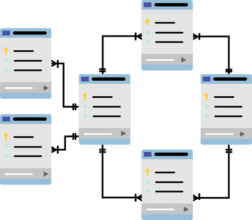 Data modeling of data architecture is the discipline that deals with how data is organized, how various (mostly business-related) processes express themselves as data flows, and how we leverage data to answer business-related questions. It involves some basic analytics (the stuff you'd do to create a pivot table, for example) but no heavy-lifting data analysis, like what you'd find in our field. There is no doubt that data modeling benefits from data analytics a great deal, but the reverse is also true. Let's explore why through a few examples. First of all, data modeling is fundamental in the structure of the data involved (data architects often design the databases we use) and the relationships among the various datasets, especially when it comes to an RDBS architecture. However, they also work with semi-structured data and ensure that the data is kept accessible and secure. Over the past few years, data modelers also work on the cloud, ensuring efficiency in how we access the data stored there, all while keeping the overall costs low. So, it's next to impossible to do any data-related work without consulting with a data architect. Since data modeling is the language these professionals speak, we need to know it, at least to some extent. Data modeling also involves generating reports based on the data at hand. These reports may need to be augmented using additional metrics, which may not be very easy to compute with the conventional analytics tools (slicing and dicing methods). So, we may need to step in there and build some models to make these metrics available for these reports. Before we do, however, we need to know about their context in the problem at hand. This context is something some knowledge of data modeling can help provide. Apart from these two cases, there are other scenarios where we need to leverage data modeling knowledge in our pipelines. These, however, are project-specific and beyond the scope of this article. In any case, having the right mindset in data science (and data analytics in general) is crucial for bridging the gap between our field and data modeling. This is something I explore in all of my books, particularly the Data Science Mindset, Methodologies, and Misconceptions one. So, check it out when you have a moment. Cheers. Since the relatively recent exodus of users from Facebook and other conventional platforms, there has been a rise in privacy-focused social media. Most of them are blockchain-based, a promising technology linked to financial rewards, usually in crypto, for the more successful content contributors. One such platform is Flote, which I've been testing for the past few weeks. In this article, I'll present some of my thoughts based on my experience with it. First of all, I'm not affiliated with Flote in any way, while no one invited me to join it either. So, I could have left at any time, especially since I have other platforms that I frequent and where I have established a network of contacts already. Still, I lingered in Flote because of its simplicity, clean user interface, and innovative model. I don't aspire to be an influencer there, but I enjoy the platform, while the fact that one of its founders, Erin Edwards, actively engages with the members of the platform offering help and promoting posts others may find interesting. I've only seen that in a couple of other places. So, why Flote? Well, it's privacy-oriented, fresh, and big on blockchain tech. That's not to say that it's there yet, though. Also, the engagement you may get on a platform like this is bound to be linked with a very particular set of people. It doesn't feature the diversity of places like MeWe, but it has the potential to do so, perhaps once the beta-testing is over. Some features still don't work well on the mobile app, which is why it's still labeled as beta, while the whole platform seems quite minimalist for a social medium. Perhaps that's why some people view it as a Twitter alternative, even if it doesn't have the silly size limitations the well-known gossiping site features. I've tried other privacy-focused platforms over the past two years, and although Flote seems quite promising, I don't think I'll drop my other ones any time soon to focus on Flote as my primary online socializing site. Still, I don't think I'll quit any time soon, partly because there is a feeling of authenticity in the users there. If you look past the biases of the user base, Flote is very open-minded and fosters debate, something most social media today have forgotten or even banned. So, if the attention we give to the sites we frequent counts for something, like a vote of sorts for what is worth spending time on, I feel that Flote deserves a chance, at least right now. After all, many places start great (e.g., Voice) and then take a wrong turn somewhere, turning into something undesirable. If you are interested in platforms like Flote, i.e., it floats your boat, but you're open to other places too, you may want to check out my Privacy Fundamentals course on WintellectNow. There I talk about various privacy-related matters, with lots of practical advice on your online options. This includes but it’s not limited to privacy-oriented social media sites. So, check it out when you have a moment. Cheers!  This topic may seem a bit strange, but I'm running out of ideas here! Still, it's interesting how often this topic comes about in mentoring sessions, especially when dealing with A/B testing. So, if you can't answer the question "when are two numbers equal enough?" in a simple sentence, perhaps you'll have something to learn from this article. First of all, the rationale of all this. Sometimes, we need to make an executive decision about whether we should apply this or the other function on the data at hand. In A/B testing, this is usually something like “should we go for the equal variances or the unequal variances variant of the T-test?” Of course, when you have two samples, the chances of their variances being exactly equal is minuscule, so why did those old sages of Stats whom we revere so much decide to have two variants of the T-test, based on the equality of the variances involved? Well, there is a different formula used since if the variances are the same, things are much simpler with the underlying math. But then the question becomes "when are these two variances equal?" and keep in mind that we are talking Stats here, so the rigidity of Math as we know it doesn't apply. We are comfortable with approximations, otherwise, we'd have to abandon the whole idea of Statistics altogether! In engineering, two numbers are equal when their difference is within a tolerance margin. We usually depict this tolerance by a threshold th expressed as a negative power of ten. So, often we have something like th = 10^(-3), which is a fancy way of saying th = 0.001. This kind of approximation, although very handy, may not apply to the problem at hand. Besides, few disciplines have the scientific reasoning and discipline that Engineering exhibits, and Stats is not one of them. Also, let's not forget that traditional Computer Science is akin to Engineering, so the approx() function found in many languages follows a similar motif, making it inapplicable to the problem mentioned previously. In Physics, things are a bit different, which is why often we talk about orders of magnitude. So, it's often the case that if two quantities A and B are different by at least an order of magnitude, they are much different. This is another way of saying that one is at least ten times bigger than the other. This is something we can apply to our problem since it gives us a relative rule of thumb to work with. Of course, an order of magnitude is quite a bit when we talk about variances, but we can adapt this to something that makes more sense in Analytics work. So, what about a fixed percentage, maybe one order of magnitude less than 1? This would translate into 10% (since 1 = 100%), something that's not too much but not negligible either. So, if v1 and v2 are the two variances at hand, we can say that if v1 <= (1+10%)v2 and v2 <= (1+10%)v1, we can presume v1 and v2 to be more or less equal. Additionally, this wouldn't work if one of them is 0, in which case the two variances would always be considered different from each other. Then again, this makes intuitive sense since we'd be dealing with a static variable and one that varies at least a bit. Also, as things are made simpler if we use as a reference point the smaller variance, we can just do a single comparison and be done with it. After all, if v2 is the smallest and v1 <= 1.1*v2, we can be sure that the reverse would also hold true. In other words, we can use a script like the one attached to this article and not have to worry about this matter much (note that this script allows us to use a different threshold too, other than 0.1). Cheers!
|
Zacharias Voulgaris, PhDPassionate data scientist with a foxy approach to technology, particularly related to A.I. Archives
December 2022
Categories
All
|
||
 RSS Feed