|
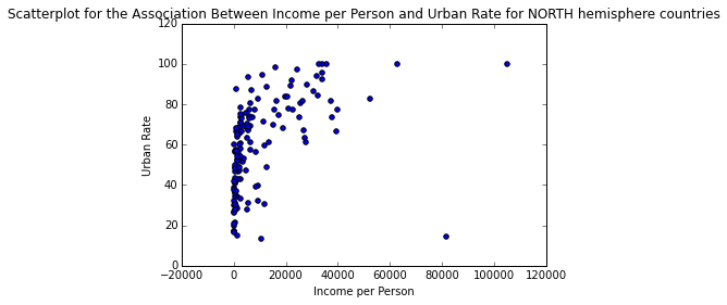
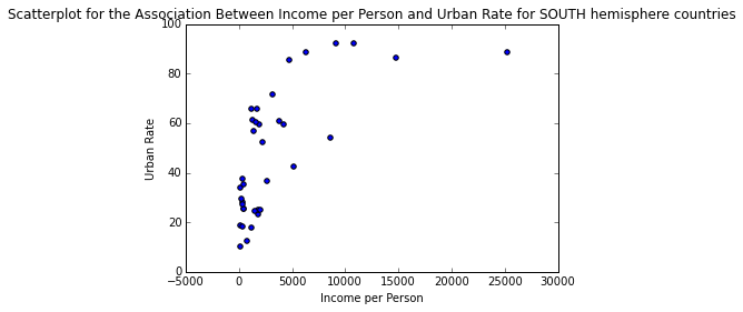
In the previous case studies we examined various socio-economical attributes for the registered countries in Gapminder. Yet, our analyses were somewhat superficial, since we didn’t look into moderating variables that may influence the end result, since the relationships among the variables are more like a web than a simple set of independent connections. This case study is an attempt to unravel this web by examining how the “hemisphere” variable moderates the relationship between per capita income (incomeperperson variable) and urban rate. To do this we need to employ an analysis suitable for numeric vs. numeric variables, such as Pearson Correlation, but... Once we import the data from the enriched data file (see 2nd case study for details on how we did this) to a data frame called “data”, we convert the variables of interest to numeric and isolate them, along with the “hemisphere” categorical variable in a data frame called “subframe”. Then we take care of all the missing values (blank in the case of incomeperperson and urbanrate and “NA” in the case of hemisphere) and store the processed data set in the data frame “clean_data”. Then we partition the data frame into two mutually exclusive ones, depending on the value of the “hemisphere” variable, namely one data frame for the North hemisphere and one for the South. Next we calculate the associations between Income per Person and Urban Rate for each hemisphere, using the Pearson’s Correlation metric. The resulting index and corresponding p-value for each hemisphere are as follows: North: (0.48338796757916214, 6.4066230298988046e-10) South: (0.67386547341458669, 6.6362307251623208e-06) So, for the North hemisphere it appears that these two variables are associated positively but in a weak way. Nevertheless, this is a very significant relationship, since the p-value is extremely small (<<0.001). For the South hemisphere the relationship is also positive but much larger (borderline strong) while being very significant too (though not as significant, probably due to the fact that there are much fewer countries in the South hemisphere). These relationships are reflected in the plots below: One important caveat of this analysis is that the Pearson Correlation fails to reflect the actual relationship between Income per Person and Urban Rate variables, which based on the plots is logarithmic in nature. So, even though the metric shows that it’s weak, it merely states that there isn’t a strong linear connection between the variables. Nevertheless, this case study clearly illustrates the presence of a moderating variables in this relationship, namely the hemisphere one. As always, you can review the data and the code used in this analysis using the attachments below.
1 Comment
In this post we’ll examine how the Pearson’s Correlation Index (aka rho, or r) can be used to assess linear relationship between two variables. Just like the previous two case studies, we’ll be using Python for this (it would be too easy to do this in R, or Julia, plus Python seems to be quite popular these days, while it’s a foxy data science tool overall). We’ll be using the Gapminder dataset, since it is large enough and diverse enough to be interesting, without being too complex, while it hold some meaningful information that can be insightful to people all over the globe). After we engineer the data a bit, so that all the variables imported from the corresponding .csv file are in numeric format, and all the missing values are represented accordingly (NaNs), we create two subsets, each containing a pair of variables the we wish to examine. Namely, we’ll be looking at how the income per person is related to the alcohol consumption as well as how the overall employment rate and the female employment rate correlate. Once the data has been cleaned of the missing values, we apply the Pearson’s correlation metric from the stats group of functions in the scipy package on each one of the cleaned subsets, clean_data_1 and clean_data_2. The results of the corresponding script are as follows: association between alcconsumption and incomeperperson (0.29539248727214601, 5.9610911215677288e-05) proportion of variance of incomeperperson explained by alcconsumption variable (or vice versa) 0.0872567215368 and association between employrate and femaleemployrate (0.85750004944391978, 1.1114525346943375e-52) proportion of variance of employrate explained by femaleemployrate variable (or vice versa) 0.735306334796 In the first case we have a correlation r = 0.295, which is positive but quite weak. Nevertheless, the corresponding p-value of 5.961e-5 is very small, making this result statistically significant, by any of the usual standards. From this we can conclude that there is no linear relationship between income per person and alcohol consumption. This is also reflected in the fact that only 8.7% of one variable’s variance can be explained by the other, a quite small proportion. In the second case we have a correlation r = 0.858, which is also positive but much stronger. Also, the corresponding p-value is 1.111e-52 which is really small, making the result extremely significant by even the strictest alpha threshold. Naturally, the proportion of the employment rate explained by the female employment rate (or the other way around) is quite high: 73.5%. All this shows that there is a strong linear relationship between the two variables, something we would expect. In another post we’ll examine other ways of measuring the correlation of quantitative variables, going beyond linear relationships. In the meantime you can check out the code created for this case study and the corresponding data, in the attachments below.
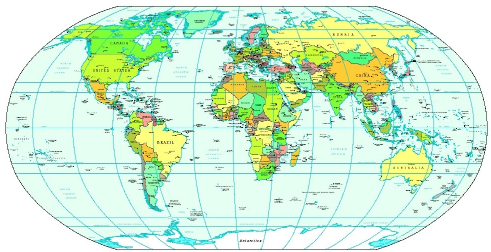
That’s a quite interesting question and coincidentally one that we can answer using the Gapminder data. First we’ll need to establish the hemisphere of each country, a fairly irksome but doable task. Using the data from www.mapsofworld.com and Wikipedia (for the countries where the site failed to deliver any information), we can classify each country to the North or the South hemisphere. For countries that are more or less equally divided between the two, we just insert a missing value (denoted as “NA” in our dataset). Note that a country that crosses the equator is still classified to one or the other hemisphere, if the majority of its area or if the majority of its main cities are on one side of it. As for the income level of a country, although no such variable exists in the original dataset, we can employ the same transformation as we did in the previous case study and end up with a tertiary variable having the values high, medium, and low. Now, on to the hypotheses. Our null hypothesis would be “there is difference between the two hemispheres, regarding the proportions of countries of high, medium, and low income level”. In other words, the proportions should be more or less the same. The alternative hypothesis would be opposite of that, i.e. “there is a difference in the proportions of countries of high, medium, and low income level, between the two hemispheres.” To test this we’ll employ the chi-square test since: 1. Both our variables are discreet / categorical 2. There are enough countries in all possible combinations of hemisphere and income level For our tests we’ll employ the significance level of alpha = 0.05, which is quite common for this sort of analysis. Once we remove the missing data from the variables (in data-frame sub1) by first replacing them with NaNs, we can create the contingency table ct1 and perform the chi square test on it. As there are 2 and 3 unique values in the variables respectively, the contingency table will be a 2 x 3 matrix: income_level high low medium hemisphere North 57 44 45 South 6 15 16 It is clear that the North hemisphere has more countries, so the high numbers of each income level category may be misleading. This problem goes away if we take the proportions of these hemisphere-income_level combos instead: income_level high low medium hemisphere North 0.904762 0.745763 0.737705 South 0.095238 0.254237 0.262295 Wow! 90% of all rich countries (countries with income level = high) are on the North part of the globe, with only barely 10% in the South. For the other types of countries the proportions are somewhat different and more similar to each other. So, if there is a discrepancy among the proportions, it is due to the rich countries being mainly in the Northern hemisphere. The chi-square test supports this intuition: Chi-square value: 6.8244834439401423 (quite high) P-value: 0.032967214150344128 (about 3%) As p < alpha, we can safely reject the Null hypothesis and confidently say that the proportions are indeed skewed. Of course there is a 3% chance that we are wrong, but we can live with it! Before we go deeper (ad hoc analysis) and examine if the pairwise comparisons are also significant, we need to apply the Bonferroni correction to the alpha value (not to be confused with the pepperoni correction, which applies mainly to pizzas!): Adjusted alpha = alpha / (number of comparisons) In our case the comparison we can make are high to low income countries, medium to low, and high to medium, three in total. Therefore, our new alpha is a = 0.017 (1.7%), making the chi-square tests a bit less eager to yield significant results. By calculating the contingency tables for each one of these comparisons, we the following results respectively: Comparison: High income level to Low income level Chi-square value: 4.3468868966915135 P-value: 0.037076661090159897 (relatively low but not significant) Comparison: Medium income level to Low income level Chi-square value: 0.011613712922753157 P-value: 0.91418056977624251 (quite high and definitely not significant) Comparison: High income level to Medium income level Chi-square value: 4.8370929759550796 P-value: 0.027853811382628445 (quite low but not significant) So, although we obtained some pretty good results originally (rejecting the null hypothesis), the ad hocs are not all that great, since none of the in-depth comparisons yield anything statistically significant (as they are all larger than the adjusted alpha). In other words, if we are given a couple of proportions for the income_level variable, we can not confidently predict the hemisphere. However, if we are given all three proportions, predicting the hemisphere is quite doable. In one of the next posts we’ll examine a more foxy way of analyzing the same data, so feel free to revisit this blog. In the meantime, you can validate these results by examining the code and the data, made available in the attached files.
In the well-known fable, a pack of wolves attack a fox and a hedgehog who were faring in the woods. The fox evades them by employing all kinds of maneuvers until they eventually give up, while the hedgehog just retreats inside its spiky armor protecting itself from the wolves. The morale is that there are different ways of tackling a problem, both of which are valid. Could this ancient fable be applicable in data science today?
In our case the wolves clearly symbolize the various challenges that make themselves apparent in a data science project. These can range from problems in the data (missing values, outliers, redundant features, etc.) to database issues, such as the data being too large, too varied, too unstructured, etc., to anything else related to the data science pipeline (e.g. feature engineering). The fact that there is no fool-proof way of dealing with them makes the whole situation interesting and in need of some expertise. In general, there are two strategies for dealing with these issues: the hedgehog approach and the way of the fox. The hedgehog strategy is the most commonly used since we live in a world that values this attitude above anything else. From the factory-like development of information workers, to the factory-like pipelines in most businesses, and the not-so-imaginative approach to tackling social problems, it is no wonder that most people lean towards this approach in data science. So, if a hedgehog-like data scientist tackles an issue in his data, there are a couple of things he tries, before giving up: going back to the theory, and seeking a solution on a search engine (usually one of the mainstream ones). And although that’s perfectly fine for the majority of cases, it doesn’t really add anything to the field or to his abilities. It is the safe option, the one yielding the smallest risk. Interestingly, this same mentality is in abundance in the academic world too, which is why revolutionary technologies are hard to come by from the university labs (though there are exceptions like MIT, Georgia Tech, and other exceptional scientific institutions). Exceptional places usually employ the fox strategy which at the very least makes the whole process intriguing and worthy of books and films (it is no coincidence that fox-like technologists, like Steve Jobs, Elon Musk, and many others, have earned the status of celebrities and left their mark in pop culture). Unlike the hedgehog-, the fox-like data scientist seeks and finds creative ways to deal with the problems he encounters. If there is no known way to deal with an issue, he often invents one, or combines existing methods in a new way, developing a new, oftentimes unique, solution. The main characteristics of this approach are out-of-the-box thinking, risk-taking, and acknowledging that there is no right answer (resulting to a focus on the essential, the function rather than the form). Unfortunately, this is an attitude that’s quite rare nowadays in the data analytics field, although it is what actually brought about data science as an independent field. Although as the fable suggests, neither one of the two approaches is better than the other, it is clear that they are not both equally useful for a given challenge. For creativity-related work (e.g. research, development of a new product, tackling a novel challenge, etc.), a hedgehog approach would be a disaster, while the fox-like approach may not work so well for unimaginative tasks (e.g. accounting, mechanical engineering, etc.). Being a rather diverse kind of work, data science lends itself more to the fox approach, though you can easily find in it elements of both. However, the way it is taught today is quite limited, making it challenging to cultivate a holistic approach to it (though you will learn the hedgehog aspect of it quite well). For this reason, in this blog we try to encourage the development of a fox-like approach, to complement the hedgehog one, and allow you to cultivate a more holistic and perhaps enjoyable view of this fascinating field. Based on the Gapminder data, there appears to be a fairly large variance in the internet use rate around the globe, as well as in the income per person. Could there be a significant signal there? Let's find out. Our hypothesis is: "There is a measurable difference in the internet use rate, in relation to the income level of a country". Obviously, the null hypothesis in this case would be "internet use rate is the same across all income levels". But first let's define what income level is. The income per person variable is continuous and has several missing values. Once the latter are eliminated, we can calculate the trisection points, corresponding to the 33rd and 67th percentile. This will allow us to split the variable into three more or less equal parts, which we can call "low", "medium", and "high". The first part of our code shows precisely that: # AUXILIARY STUFF def categorize(x, m1, m2): if np.isnan(x): return np.NaN if x <= m1: return "low" if x > m2: return "high" return "medium" # MAIN METHOD # Initialization import numpy as np import pandas as pd import statsmodels.formula.api as smf import statsmodels.stats.multicomp as multi data = pd.read_csv('gapminder.csv', low_memory=False) #Set variables to be numeric data["incomeperperson"] = data["incomeperperson"].convert_objects(convert_numeric=True) data["internetuserate"] = data["internetuserate"].convert_objects(convert_numeric=True) #Handle missing data sub1 = data[["incomeperperson", "internetuserate"]] # select only relevant columns sub1['incomeperperson'] = data['incomeperperson'].replace("", numpy.nan) sub1['internetuserate'] = data['internetuserate'].replace("", numpy.nan) #Break down incomer per person into 3 groups X = np.array(sub1["incomeperperson"].dropna()) m1, m2 = np.percentile(X, [33 ,67]) # trisection points of incomeperperson variable n = np.size(sub1, 0) sub1["income_level"] = [""] * n for i in xrange(n): sub1["income_level"][i] = categorize(sub1["incomeperperson"][i], m1, m2) Now it's time to deploy a (Stats) model to examine the relationship between our variables (internetuserate and income_rate). Based on the nature of the variables, we choose to use the basic ANOVA model, as seen in the following code: #Perform ANOVA on income_level and internetuserate variables to test initial hypothesis sub3 = sub1[['internetuserate', 'income_level']].dropna() model0 = smf.ols(formula='internetuserate ~ C(income_level)', data=sub3).fit() print (model0.summary()) OLS Regression Results ============================================================================== Dep. Variable: internetuserate R-squared: 0.681 Model: OLS Adj. R-squared: 0.678 Method: Least Squares F-statistic: 192.3 Date: Tue, 01 Mar 2016 Prob (F-statistic): 2.10e-45 Time: 10:53:57 Log-Likelihood: -764.25 No. Observations: 183 AIC: 1534. Df Residuals: 180 BIC: 1544. Df Model: 2 Covariance Type: nonrobust ============================================================================================= coef std err t P>|t| [95.0% Conf. Int.] --------------------------------------------------------------------------------------------- Intercept 66.1814 2.051 32.267 0.000 62.134 70.229 C(income_level)[T.low] -55.8170 2.889 -19.322 0.000 -61.517 -50.117 C(income_level)[T.medium] -36.4350 2.877 -12.664 0.000 -42.112 -30.758 ============================================================================== Omnibus: 6.163 Durbin-Watson: 2.014 Prob(Omnibus): 0.046 Jarque-Bera (JB): 7.413 Skew: -0.240 Prob(JB): 0.0246 Kurtosis: 3.861 Cond. No. 3.76 ============================================================================== From this summary, it is clear that the F-statistic is really high (over 190), something that is reflected in the p-value of the model (2e-45). It is clear that even at a very low alpha threshold (e.g. 0.001), this result is significant. So, there is a strong relationship between the income level of a country's citizens and their use of the internet. But does this hold across the different values of the income_level variable? The above model cannot say. If we want to find out... To do that we apply the ANOVA model again, this time for each pair of the income_level variable: sub = sub3[sub3['income_level'] != "high"] model1 = smf.ols(formula='internetuserate ~ C(income_level)', data=sub).fit() print (model1.summary()) OLS Regression Results ============================================================================== Dep. Variable: internetuserate R-squared: 0.331 Model: OLS Adj. R-squared: 0.326 Method: Least Squares F-statistic: 59.99 Date: Tue, 01 Mar 2016 Prob (F-statistic): 3.25e-12 Time: 11:01:08 Log-Likelihood: -497.03 No. Observations: 123 AIC: 998.1 Df Residuals: 121 BIC: 1004. Df Model: 1 Covariance Type: nonrobust ============================================================================================= coef std err t P>|t| [95.0% Conf. Int.] --------------------------------------------------------------------------------------------- Intercept 10.3644 1.777 5.834 0.000 6.847 13.882 C(income_level)[T.medium] 19.3820 2.502 7.746 0.000 14.428 24.336 ============================================================================== Omnibus: 8.935 Durbin-Watson: 1.969 Prob(Omnibus): 0.011 Jarque-Bera (JB): 8.830 Skew: 0.636 Prob(JB): 0.0121 Kurtosis: 3.324 Cond. No. 2.63 ============================================================================== sub = sub3[sub3['income_level'] != "medium"] model2 = smf.ols(formula='internetuserate ~ C(income_level)', data=sub).fit() print (model2.summary()) OLS Regression Results ============================================================================== Dep. Variable: internetuserate R-squared: 0.765 Model: OLS Adj. R-squared: 0.763 Method: Least Squares F-statistic: 388.0 Date: Tue, 01 Mar 2016 Prob (F-statistic): 2.94e-39 Time: 11:01:42 Log-Likelihood: -502.99 No. Observations: 121 AIC: 1010. Df Residuals: 119 BIC: 1016. Df Model: 1 Covariance Type: nonrobust ========================================================================================== coef std err t P>|t| [95.0% Conf. Int.] ------------------------------------------------------------------------------------------ Intercept 66.1814 2.012 32.893 0.000 62.197 70.165 C(income_level)[T.low] -55.8170 2.834 -19.697 0.000 -61.428 -50.206 ============================================================================== Omnibus: 14.498 Durbin-Watson: 1.792 Prob(Omnibus): 0.001 Jarque-Bera (JB): 22.232 Skew: -0.580 Prob(JB): 1.49e-05 Kurtosis: 4.750 Cond. No. 2.63 ============================================================================== sub = sub3[sub3['income_level'] != "low"] model3 = smf.ols(formula='internetuserate ~ C(income_level)', data=sub).fit() print (model3.summary()) OLS Regression Results ============================================================================== Dep. Variable: internetuserate R-squared: 0.511 Model: OLS Adj. R-squared: 0.507 Method: Least Squares F-statistic: 125.6 Date: Tue, 01 Mar 2016 Prob (F-statistic): 2.18e-20 Time: 11:02:21 Log-Likelihood: -524.39 No. Observations: 122 AIC: 1053. Df Residuals: 120 BIC: 1058. Df Model: 1 Covariance Type: nonrobust ============================================================================================= coef std err t P>|t| [95.0% Conf. Int.] --------------------------------------------------------------------------------------------- Intercept 66.1814 2.317 28.558 0.000 61.593 70.770 C(income_level)[T.medium] -36.4350 3.251 -11.208 0.000 -42.871 -29.999 ============================================================================== Omnibus: 4.358 Durbin-Watson: 2.021 Prob(Omnibus): 0.113 Jarque-Bera (JB): 3.846 Skew: -0.419 Prob(JB): 0.146 Kurtosis: 3.235 Cond. No. 2.64 ============================================================================== It appears that this conclusion holds true even across the different income levels (e.g. there is a strong difference between the internet use of the countries with medium income and that of the countries with high income). The corresponding p-values are also very low, meaning that all these results are scientifically robust (it is extremely unlikely to be due to chance). Of course this doesn't mean that there is a causal relationship between the two variables.
|
Zacharias Voulgaris, PhDPassionate data scientist with a foxy approach to technology, particularly related to A.I. Archives
April 2024
Categories
All
|
|||||||||||||||||||||||||||||||||||||||||||||||||||||||||


 RSS Feed