|
Introduction
I've written about Nim in the past, but it's been a while. So, I decided to do a deep dive on it this time as the language seems to have evolved a lot since then, plus I had promised that I'd keep an eye on it. So, let's look at this language anew and explore how it's faring these days. Why Nim and why it's worth learning about it Nim has been around for almost a decade and a half now but it remains in relative obscurity. So, why should you learn about it nevertheless, especially when there are other, more established languages out there? Well, Nim is super fast (it compiles to C, so you can expect similar performance), it's very intuitive in its syntax (especially if you are coming from a Python background), and it's versatile. It also has a committed team without a big company behind it, making it the de facto underdog of programming languages. Despite its hardships, it has managed to get a production-ready version out and find some niche use cases to make it stand out from the crowd. Its documentation is pretty good (much better than many other languages' docs) while its official website even has some comprehensive tutorials for learning Nim. It has a variety of packages and it's constantly growing in its codebase, making it a very promising language still, against all odds. Nim from a Pythonista's perspective Although Python is hardly a "real" programming language and shouldn't be compared to languages like Nim that do some real heavy lifting, these days it's in vogue. It's a fairly decent scripting language ideal for someone who's never learned the ins and outs of computers and how they work. Perhaps that's why it's so popular today. What Python does well is its syntax and the simplicity of its code. Some call it pseudocode that runs and they aren't wrong. Once you get accustomed to its idiosyncrasies, Python is fairly straightforward to work with while its code is very similar to the pseudocode version of an algorithm. Nim adopts this attribute of Python, making its code very intuitive and comprehensible, even to newcomers to the language. So, for a Pythonista, Nim will seem strangely familiar and should be easy to understand from the very beginning. This was probably a design decision, to make the barrier of entry to the language as low as possible. It's noteworthy that the language under the hood is quite different though as the memory management, the indexing, and the whole approach to variable-setting are closer to that of low-level languages. So, it may still require some effort to learn Nim properly, even if you have mastered Python. Nim from a C programmer's perspective As Nim is somewhat closer to C than any other language, it also is easy for a C language user. After all, the Nim compiler gives you the option to see the C code of each Nim program you create. If you are used to the curly brackets that C features in its programs, Nim gives you the option of writing your scripts similarly, using parentheses instead. This way, the barrier to entry to this language shouldn't be too high in this case either. The fact that it uses 0-point indexing like C and similar data structures makes Nim familiar even to C programmers. Nim's compiler is much better, however than that of C and any other low-level language. It can pinpoint issues so that you don't have to worry about the executables once they are created. It can also provide you with some useful feedback to make troubleshooting easier. Additionally, memory management is better than C and overall it's easier to work with Nim as it's more high-level as a language. Nim from a data professional's perspective From a data professional's perspective, Nim is getting there. Even if its base package doesn't support any complex data structures that lend themselves to real-world data (like Julia does, for example), it has a plethora of external packages that do the trick. So, the language seems to be data-ready right now, even if it's hard to see it competing with Python or Julia for data-related work, right now. After all, beyond the coding capabilities of a language, other factors come into play, such as the language's integration with Jupyter notebooks. Kotlin integrates smoothly (even if it is a compiled language like Nim), but Nim's integration is iffy. Some commands like the one requiring input from the user don't seem to work at all, plus the Jupyter integration module is fairly new, compared to that of other programming languages. Additionally, Nim doesn't have a large data science community, making it a bit more challenging for a Nim learner from the data science field to feel at home. Although this may change in the future, it seems that only the most committed data scientists can find Nim a valuable tool for analytics-related work. Nevertheless, Nim lends itself to data engineering work as it has various database and data file packages, while its speed makes it ideal for this sort of task. Nim's role in Cryptography and Cybersecurity What about cryptography though and cybersecurity in general? Well, in this niche Nim seems to thrive. It has mature libraries for randomness and hashes, while it's fairly easy to code something related to this field from scratch. The fact that it's very fast makes it ideal for this kind of application. Also, Nim's ability to create small executables gives it more flexibility and enables it to emulate "red team" scenarios, so that the "blue team" can better prepare for cyberattacks. It's a shame that the cybersecurity and cryptography communities aren't as open-minded about alternative programming languages to give Nim a shot. This language has a lot to offer here and it wouldn't be surprising if in the future more applications in these fields find themselves coded in Nim. This is likely going to happen through hobbyists and independent researchers with a knack for programming though. Nim prospects Beyond all these facets of Nim, the language seems to have a promising future right now. There are several projects in the works, it has a UI framework, and the number of content creators writing about Nim has increased. More people are becoming aware of the value-add the language offers, while the world's obsession with Python is being challenged as more easy-to-code-in languages enter the coding sphere. Although it's unlikely it will ever be as popular as the languages that have come to dominate, it's bound to continue and become better as its community grows. Nowadays there are even conferences on Nim and the language seems to become easier to adopt and acknowledge, at least for certain use cases that systems computing. The big milestone, however, would be if Nim enters the world of code learning platforms like CodeAbbey, where people can solve interesting challenges using the language and refine their skills in the process. The fact that it's already on Exercism and Rosetta Code, however, is a step in the right direction. Final thoughts about Nim So, there you have it. Nim is a powerful programming language with quite a few things to offer, as it's heading toward version 2.0. Whether it will get a large enough following is up to you as most people tend to shy away from language that doesn't have the backing of a large company or academic institution. Also, it seems that lately there are lots of languages out there, so deciding to commit to this one is even more challenging. Yet, those who have delved into Nim can see its merit and are likely to continue with it. Even if it doesn't make it big like the languages it borrows from, it's bound to stick around and thrive in its niches.
0 Comments
 It's been over two years since the Compressed Data Format (CDF) made its debut, making storing data files in Julia a breeze. Not only does it handle various types of data easily, but it also allows for comments and any other stuff you'd like to include in your data file before sharing it with other Julia users. The native data file formats the language has been okay, but when it comes to larger datasets, they fall short. Also, conventional data file formats like CSV and JSON, although mature and easy to use, tend to be bulky as the number of data points/variables grows. CDF remedies all that by employing a powerful compression algorithm on the data at hand. The CDF script consists of a series of functions while it leverages another script for handling binary files. Because if you want to do anything meaningful with files, you need to go down to the 1s and 0s level. The conventional IO handling Julia offers is fine, but it's limited to text files mainly. However, the language has binary file capabilities, which are leveraged and simplified in the binfiles.jl script that CDF relies on for its IO operations. That script has just two functions, one for reading binary files and one for writing them. Naturally, everything on that level is expressed in Int8 vectors, as a data stream related to a binary file is a series of bytes, often in the form of an 8-bit number (ranging between -128 and 127, inclusive. So, if you wish to delve into this sort of file operation, make sure you familiarize yourself with this data structure. Fortunately, the CDF script is more high-level than the binfiles.jl one. Still, it needs to deal with binary files at one point, so it has to translate the data streams it handles into Int8 vectors. To make the most of the bandwidth your machine has, it breaks down the whole process into these distinct phases, which you can view in Fig. 1: 1. Turning the data into a Dict object if it's not in that form already. 2. Turning the dictionary into a text stream (string variable). 3. Compressing the text stream. 4. Passing the compressed data into the binary files function to read/write the corresponding files. 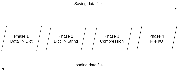 Figure 1. The four phases of the CDF file creation/loading process.
The handling of the binary files takes place using the binfiles.jl script, as mentioned previously, so we won't cover it in depth in this article. For the remaining phases, let's start from the easy part: compression (phase 3). Here the CodecZlib package is used, which contains a bunch of compression algorithms. The CDF script leverages the Deflate algorithm due to its speed and efficiency. Naturally, as everything is already in the form of a string variable by that stage utilizing the compression algorithm is pretty straightforward. Now the problem becomes turning everything into a string (phase 2). Although this seems straightforward, doing that all while ensuring that the whole process is easily reversible can be challenging. Fortunately, if everything is already in dictionary form, it's not that hard. After all, a dictionary comprises various keys which correspond to certain values, all of which can be retrieved through the keys() and values() functions of the dictionary class. So, handling a dictionary isn't that hard, and it can be done methodically. Of course, dumping the dictionary's contents into a string file isn't a great idea since the various key-value pairs need to be separated. One way to do this, which is also the way CDF is written, involves putting all the keys together in the beginning and then all the values corresponding to these keys. Each key is separated from the next using a space (the keys correspond to variable names, so they tend to be void of spaces). From that point on, for all pieces of data that need to be connected in that output string, a special character is used, one which doesn't come into play in data files. This way, it's easy to split the string between the keys and the values, using that special character as a separator. The same goes for all the different values that are added to the string. Since they might contain spaces in them, we use the special character to separate each from the next. Following that, we also store the types of these values so that we can reconstruct the original contents of the dictionary. The types are contained in a separate array and are separated by spaces. To make this information more easily accessible, we position it at the end of the string, separated from the values part using the special character. To create the dictionary (phase 1), we merely need to put the variable at hand into an empty dictionary, with the variable name as its key and its contents as its value (this is done automatically with the corresponding function of the CDF script). This process is a bit more cumbersome a process as it requires the user to input both the variable and its name, while it’s limited to a single variable (e.g., a matrix of a dataset). That’s why it’s generally better to have all the data available as a dictionary before using the CDF script. This way, if you need to add any comments to the data, you can do so by adding another key-value pair to the dictionary where the data lives. The data types supported by CDF at this stage are String, Char, Real, Float64, Int64, and Array of numbers of bits. In future versions of CDF, it may also be able to handle more complex scenarios, such as DataFrames, nested arrays, arrays of strings, etc. CDF can be useful for storing models too, with the (hyper)parameters being in a particular part of the dictionary, the operational conditions in another part and some metadata about the training data and the model's tested performance in another part. This way, by loading this CDF file, you can get all the relevant information about the model to use in your project.  Although I really enjoy Julia and other new programming languages, I also use Python, SQL, etc. for various projects. Beyond that, I tend to mentor students in these more conventional languages, as it's part of their curriculum. Learning these languages, however, often comes at a cost and if someone has already shelled thousands of dollars in a course, it's doubtful they would be willing to spend more to go deeper on these subjects. Fortunately, AIgents has you covered. This Data Science and AI platform for practitioners and learners in these fields recently launched a learning branch on its website, featuring a selection of useful resources for learning these technologies (these live on various sites, which you can find on your own but AIgents saves you time by do this tedious task for you and curating them to some extent). The best part is that all of these resources are free while there is also a community this platform has, to facilitate further such initiatives. You can check it out here. Cheers!  Remember all those videos I used to make for Safari / O'Reily's Learning platform? Well, most of them are now gone but the best ones (according to the publisher) are still available for you, in a pay-per-view mode. Learn more about them through this 1-minute video I made about them. It's just six of them at the moment, but I may get more of them out there in the months to come. Cheers  It's been about 7.5 months since I signed the contract for this book and now it's already on the bookshelves (so to speak). At least the book is available to buy at the publisher's website, in print format, PDF format, or a bundle of both. If you have been paying attention through this blog, you may be aware that you can get it with a 20% discount if you use a certain 4-letter code, when buying it from the publisher (hint: the code it DSML). I put a lot of work into this book because it's probably going to be my last (technical) book, at least for the foreseeable future. Its topic is one that I've been very passionate about for many years and continue to delve into even today. Even though the book is very hands-on, accompanied by code notebooks (or codebooks as I often call them), you can read it without getting into the code aspects of it. Also, the concepts covered in it are applicable in any programming language used in data science and A.I. If you want to learn more about the book, feel free to attend the (free) event on Friday, September 9th at 10 am ET (register through this link). I hope to see you then! Update: I've made a short video about this, which I encourage you to share with anyone who might be interested: https://share.vidyard.com/watch/d58yZn9Y1cnWq6rQAsrotq?  Unfortunately, datasets aren't as easy to gauge as the butterflies in this picture. Yet, even if the simpler cases where we can make a descriptive plot to highlight the geometry involved, similarity is not a binary matter. Two datasets may be somewhat similar or dissimilar, without being identical or in stark contrast. So, how could we gauge similarity in an N-dimensional space? The simplest thing to do is run a bunch of t-tests, one for each variable involved. This approach may be fine for someone new to the field (especially if the people managing this person's team aren't knowledgeable about these matters), but it won't work well. There are several underlying assumptions in this strategy that rob it of its validity and, possibly, its effectiveness. The Index of Congruence is a simple heuristic based on the Index of Peculiarity, which in turn is congruent to the Index of Discernibility (though not focused on classification scenarios per se). The Index of Congruence does one simple thing: gauge the similarity of two matrices of real numbers on a scale of 0 to 1 with high values denoting strong similarity. It's not perfect but it does what it sets out to do, and does so swiftly. If one of the datasets is larger than a given threshold, some (random) sampling takes place in both datasets, preserving the original ratio in sizes, before the heuristic is applied. Also, normalization takes place in the back-end without worrying the user, since we have better things to do than worry about the scale of the variables at hand, right? I could write about this heuristic for a while, but I'm sure you'd rather see it in action. So, I'm attaching a Jupyter notebook that you can check out on your own. No, I haven't switched to this kind of code notebook as I'm still in favor of Neptune notebooks, but when it comes to showcasing something, Jupyter notebooks remain the best option. Cheers!
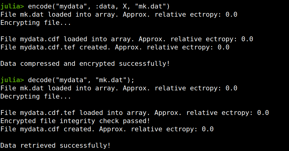
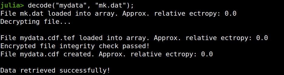
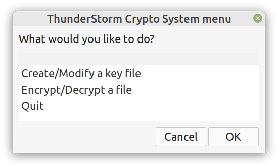
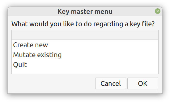
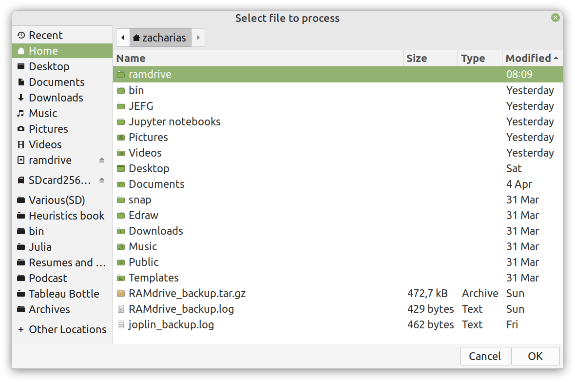
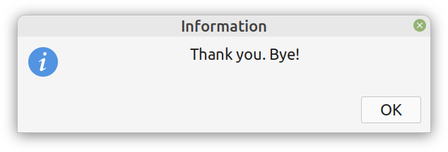
 Lately I published an episode of my podcast where I talk about compression and encryption as privacy tools (link). That’s all nice and dandy but how do we do any of that in practice? Well, most compression programs have an encryption option, which may be sufficient for low-confidentiality documents. But what about datasets that contain lots of PII? And if you are like me, you may use Julia for processing them, since it’s by far the most efficient programming language for the task, that’s also high-level. Enter ComCrypt, a simple script that does high-quality compression and quantum-proof encryption all in one go. Namely, it makes use of the CDF script which I’ve talked about before (it’s been about two years since I created it) for compressing the data into an archive having the .cdf extension (which stands for compressed data format and it’s native to Julia). Then it applies ThunderStorm to it, using an external key file. If anything goes wrong throughout this process, ComCrypt alerts the user with some error message informing about the part that threw the error. Otherwise, it yields a message saying that the data has been compressed successfully. The reverse process shares the same philosophy. Currently, ComCrypt at its first version so its scope is a bit limited (e.g., it handles only a single data object per file). However, there are ways to make it more usable and useful. In any case, it’s already a useful little tool for keeping your data safe when working in the Julia environment. Also, it’s very light on the dependencies (just one external library and a few Julia scripts). Cheers.  Overview I've been working on this cipher for several years now, and although it's not the first one I've developed, it's the best one, so far. Not just in terms of security but also in speed and customization. I haven't touched the algorithm in a couple of years now, but I recently did some updates on its shell functions and its GUI for better usability. But I'm getting ahead of myself. Let's start with some basics first, in case you are not familiar with it. What ThunderStorm Is ThunderStorm is a semi-symmetric encryption system designed for codes impenetrable by conventional cryptanalysis methods. Unlike other encryption methods, it doesn't rely on prime numbers and factoring, while it employs true randomness in the keys it uses for additional security. It currently exists in two versions: one that's order-sensitive and one that's purely symmetric and order-indifferent. The former makes for a stronger cipher, while the latter is lighter. ThunderStorm is implemented entirely in Julia (recently tested in v.1.7.2 with no issues) and has minimal dependencies on any libraries. How It Works In a nutshell, ThunderStorm works as follows. It captures all the relevant information regarding the size of the original file and its hash. It then encrypts it using the hash of the key. This is the header of the encrypted archive. Then a random amount of noise is created and added to the original file. After that, the data is encrypted and shuffled using the key, in a byte-wise fashion. The resulting archive, which is somewhat larger than the original is outputted using a file extension that makes it clear what it is. For the decryption process, the reverse is done. Note that if a single bit in the key file is off, the decryption process won't work, or if it does, it will yield a completely different file that would be unrecognizable. Also, if you were to take a random byte in the encrypted archive there is no way of knowing if that byte is an encrypted part of the original file (it could be just noise) or if it is which part of the file it comes from or what it is exactly. Also, only part of the key is usually used for the encryption, while its parts are shuffled before being utilized in the encryption process. I had published a video on ThunderStorm back in my Safari days, but it's no longer available since the contract with O'Reilly (which acquired Safari at one point) came to an end. ThunderStorm Use Cases The ThunderStorm system has several real-world use cases. Primarily, it is ideal for individual use, particularly for static documents (e.g., a password archive, financial records, etc.). This includes documents that are stored in the cloud or a web server. Additionally, ThunderStorm can be modified to be used for exchanging sensitive documents, where increased cybersecurity is a requirement. For all the use cases, large encryption keys are strongly recommended, something possible through an auxiliary method of the ThunderStorm system. A large key can be manufactured in such a way that it has zero ectropy (i.e., maximal entropy possible), making cryptanalysis extremely difficult if not altogether impossible. The fact that keys can be reused in ThunderStorm with minimal risk is an asset that can be harnessed for efficiency. Latest Improvements Since I'm a big fan of continuous improvement (Total Quality Management), I decided to make a GUI for ThunderStorm, even though I'm not a GUI kind of guy. Still, after having developed my BASH scripting skills enough, I was able to do that. So, recently I came up with a new script that leverages a few window screens to facilitate the use of this program. It still uses Julia on the back-end, but it can run directly from the shell (or the file manager, if you prefer). Below are some screenshots of the interactive aspects of that script. Note that some of the functionality of ThunderStorm was removed to make the whole program easier for the average user. For the more tech-savvy users, the functionality remains and can be accessed through the corresponding Julia scripts. Parting Thoughts Probably this is not the last update on ThunderStorm since it's been my pet project for a while now. Also, considering how feeble most ciphers are when it comes to the quantum threat, someday enough people may see value in a robust and unconventional cipher, to warrant further R&D on it. Until then, it will probably remain a niche thing, much like the language it was written in, as most high-level developers prefer to stick with the languages they know instead of going for a newer and objectively better language like Julia. Cheers!  About five months ago, I started writing a new technical book. I didn't have to, but the idea was burning me, and as I had been working on a particular data science topic the previous months, I felt it deserved to be shared with a larger audience. Of course, I could have just shared some code or perhaps put together some article, but the idea deserved more. So, I reached out to my publisher, sent him a proposal with an outline of the book, and before long, I was good to go! During these months I had been writing regularly (pretty much daily, at least on weekdays), with just a couple of weeks off, one for the Christmas holidays and one for the preparation of my podcast. This book project involved both text, images, and code (in the form of a new type of code notebook, for Julia). So, at least, I didn't get bored, plus I was a bit imaginative with a couple of the problems I tackled in the code notebooks. Although it's a bit soon to tell when the book will be out, at least the most time-consuming part is behind me now. Hopefully, I'll be able to focus more on other projects now. I'll keep you posted through this blog regarding updates on the book. Cheers!  As much as I'd love to write a (probably long) post about this, I'd rather use my voice. So, if you are interested in learning more about this topic, check out the latest episode of my podcast, available on Buzzsprout and a few other places (e.g., Spotify). Cheers!
|
Zacharias Voulgaris, PhDPassionate data scientist with a foxy approach to technology, particularly related to A.I. Archives
April 2024
Categories
All
|
||

 RSS Feed